Peer Learning with P5
I have always been a tinkerer, I love to craft–Pinterest is my jam, but with coding I’ve really never felt like I have been able to get to a place where I could tinker. Atul convinced me to apply for this fellowship because it would give me a chance to experiment and learn p5 in order to tinker with code in a lightweight way, so that we could help other designers and artists who, like me, might be enthusiastic but just a bit overwhelmed with code.
The way that I approached learning p5 was pretty simple. I started by watching Dan Shiffman’s videos on YouTube. They are great tutorials and super funny. Atul and I watched together, and then when I reached a point where I felt like I could try something, I would stop and make something in CodePen. I chose CodePen because it was a great environment for me to prototype an idea and then share it with Atul, so that he could then provide me mentorship directly in the code, or if we weren’t physically next to each other, with Screenhero.
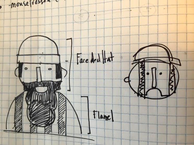
My first little project that I made for myself was designing a lumberjack. I don’t know where the idea came from, but I just went for it. Like most of my projects, I started by sketching in my notebook.

This helped me to think through how I could break down my concept into shapes, which I could then reference in the documentation section on the p5 site.

The first thing that I realized was a challenge for me was understanding the canvas. It’s basically the first thing that you do when you start a sketch in p5, and I get the general size of the container that I’m working in, but when I was making shapes, I was ballparking it - almost as if I had imaginary rulers on the page guiding my designs. Once I got the hang of that, the project became an exercise in deconstructing my composition into shapes and practicing how they work together, in groups, alone, overlapped, with different opacities, etc.
As I worked, Atul encouraged me to keep my thoughts about how to improve the tools in a notebook, so that once I mastered the technical skills, we prototype making the user experience better for learners. My notes are pretty simple, they look like this:
Canvas - why is it stuck to the edge? I want to move it to the center
Is there a chart somewhere that shows all the RGB values?
You can’t copy and paste from the documentation.
You can’t have two functions that are named the same thing.
You need to specify what functions will be “drawing” by putting them under the draw function and then calling them.
I wish there was a ruler
I wish that there was a color picker in the IDE
I wish that the p5 site was responsive because I make the reference screen small while I’m coding
Error: Uncaught SyntaxError: missing ) after argument list    <— that feels really wordy and confusing, just tell me I forgot a closing parenthesis.
The comments in the code in the examples aren’t legible if they are long lines on copy.
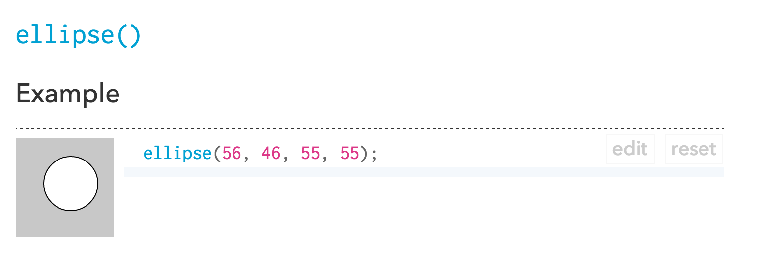
The edit and reset buttons cover the documentation
Here’s what the Lumberjack looks like right now. You can check it out on my CodePen. It even has a little animation - with a wink that I threw in there!
See the Pen Lumberjack by Jess (@iamjessklein) on CodePen.
At this point all of my notes that I created from this exercise have been converted into github issues in the p5 website repo. So, the question of the day: was I able to feel like I was tinkering with p5? Yes. I think that the reason why was that I was able to start and end small. I wasn’t building an application or website, just a simple illustration. It’s something that I was able to do by myself, but the learning experience was greatly improved by having a more advanced learner such as Atul by my side. The resources on the p5 website are great; I ended up supplementing them a bit with Getting Started with p5.js by Lauren McCarthy, Casey Reas and Ben Fry.
I’m now wondering how I might improve this exact experience for learners. Here are some initial thoughts:
- Make documentation forkable/remixable. Using CodePen was invaluable for me. I could code, not have to deal with servers and it felt like a safe space to fail. It also provided a way for me to pass around code with Atul fairly easily. This is currently a bit challenging to do via the p5 reference library. There are some simple solutions such as widgetizing elements that would support this kind of interaction.
- Start a community gallery for examples. Getting Started with P5.js had some great examples, and the p5 website itself has even more examples on the homepage - but either the examples are too basic or unfathomable. I want an easy way to see designs and code examples. This will do two things: 1. Expose the design process and thinking behind p5 sketches. 2. Raise the bar of work done in the field, by essentially crafting an online gallery space.
- Make errors friendlier. I failed a lot in this experiment, but because of mentorship and the approachability of the p5 suite of tools, I felt compelled to continue on my coding quest. This kind of support can be translated into simple errors and suggestive, didatic resources.
That’s where I’m at now. I am going to work a bit on tackling these ideas with Atul and the p5 team and continue to build out the animations for the lumberjack. I’d love to hear from you. As a learner, have you experimented with peer learning through pair programming or like in my case, peer binge watching YouTube tutorials? What has been an effective learning technique or tool for you?
Feel free to tweet your responses to @iamjessklein!